PRODUCT DESIGN
AI
Styling app that lets you try on your own clothes before you wear them
Styling app that lets you try on your own clothes before you wear them
I designed Anything AI from 0 →1 the digital twin, the wardrobe, the try-on experience, the design system, and the commerce layer. It launched at AYC Mumbai event to 100+ sign-ups on day one, with more than a quarter returning the next day.
I designed Anything AI from 0 →1 the digital twin, the wardrobe, the try-on experience, the design system, and the commerce layer. It launched at AYC Mumbai event to 100+ sign-ups on day one, with more than a quarter returning the next day.

ROLE
Product Designer &
Researcher
Product Designer &
Researcher
HOW I BUILD
1 PD
4 engineers
& more
1 PD
4 engineers
& more
STRATEGY DESIGN
USER RESEARCH
UI/UX DESIGN
MOTION DESIGN
INTERACTION DESIGN
FRAMEWORK BUILDING
QUALITY CONTROL & EXECUTION
PROLOGUE
Create a digital twin. Digitize your closet. Wear it before you wear it.
People have wardrobes full of clothes but still struggle to decide what to wear, visualize new outfit combinations, and know what truly suits them. The challenge was to turn AI-powered virtual try-on into a personalized styling experience that helps users rediscover their wardrobe, make confident outfit choices, and shop with greater confidence.
Research → insight → response
I explored how people interact with their existing wardrobes, plan outfits, discover new combinations, and make decisions when shopping online. The research focused on identifying where uncertainty occurs and understanding how AI could support these moments without taking away personal choice or individual style.
INSIGHT 1
People style in two modes: 'just dress me' and 'let me build this look.'
→ Two entry points - Try-On and the AI assisted Shuffle - instead of one compromised flow.
INSIGHT 2
Trust is decided at the photo-upload moment, not in a settings page.
→ Guided 3-step capture, review-with-retake, privacy promise placed at the point of hesitation.
INSIGHT 3
AI errors are inevitable; unrecoverable AI errors are a design choice.
→ Editable category at review;
recovery paths designed around real model behavior.
DECISION 1
How should the twin be created?
The app's first ask is face and body photos before delivering any value. Users self-select into a try-on app, so the risk wasn't convincing them; it was a sensitive task feeling careless.
A. Minimal: camera straight away - fastest, but reads careless with sensitive data
B. Guided multi-step with review - slower, but every step earns the next
Chose B, Guided three- step flow, instruction-led face/body capture, review-with-retake. A plain privacy promise placed at the exact moment of doubt make a sensitive ask feel guided instead of careless.

DECISION 2
The wardrobe designed for the AI we have, not the AI we wanted
Clothing and accessories ran as separate upload flows - an artifact of different AI models, not user logic. And testing surfaced misclassification: items tagged as the wrong category, silently breaking try-on.
A. Keep flows split, wait for better models - clean engineering story, users inherit our architecture
B. A slot model: rules for garment composition invisible constraint, reliable results
Chose: B, I Merged clothing and accessories into one flow; users shouldn't inherit our model architecture. I documented the friction it caused and walked engineers through it from the user's side: people were paying a usability cost for our architecture. Also the category became editable at the review step, corrected in a tap. Rather than designing around it,
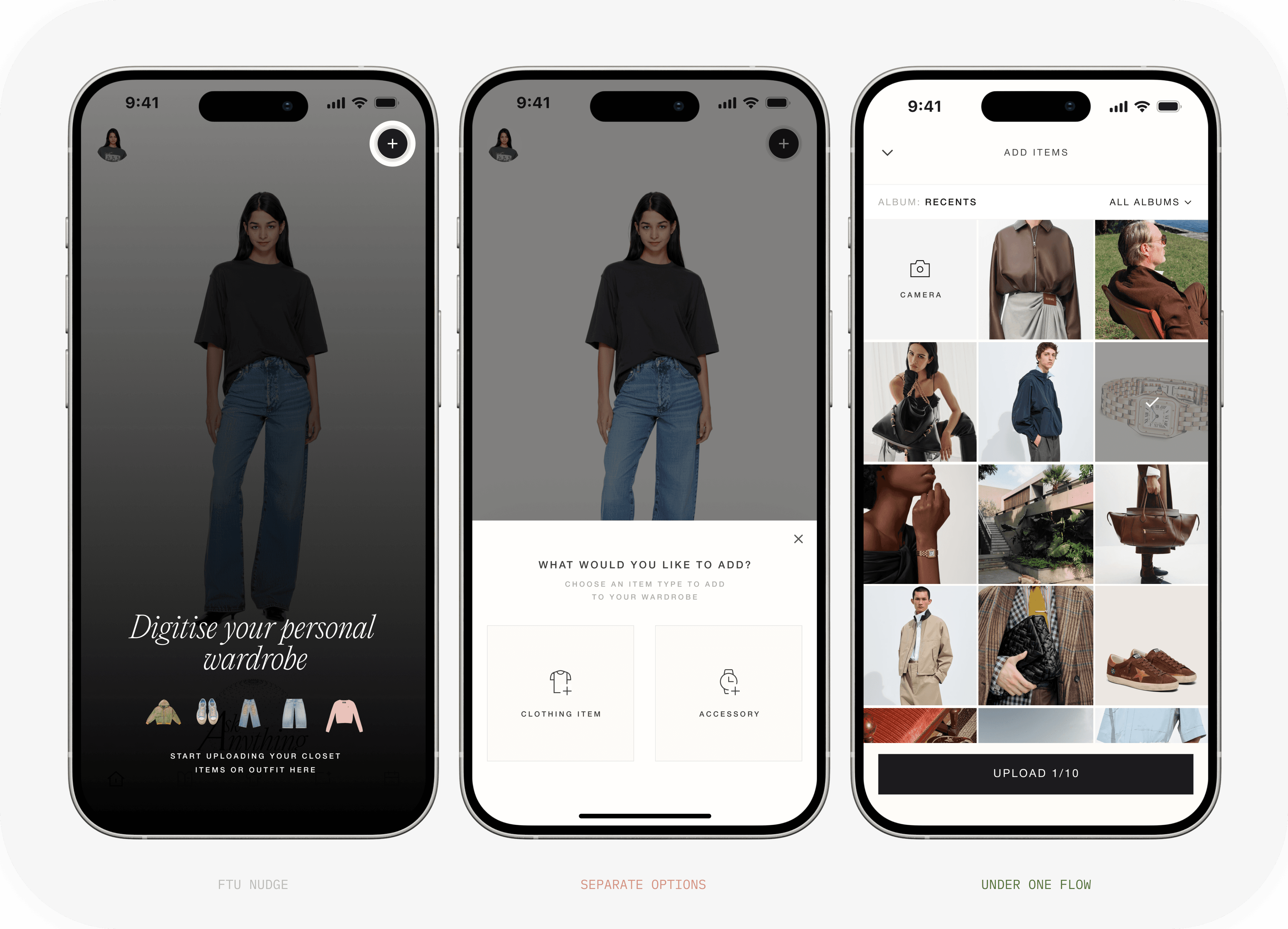

Sometimes the design fix is helping developers see the product through the user's eyes, so the architecture bends toward the person instead of the person bending toward the architecture.
Sometimes the design fix is helping developers see the product through the user’s eyes, so the architecture bends toward the person instead of the person bending toward the architecture.
DECISION 3
The Trial Room - from a grid to a mirror
V1 shipped and tested well: small avatar on top, wardrobe always visible below. But the result rendered small (a tap away from full-size), and the layout had no room for search, filter, or a future store catalog.
I redesigned it as a mirror - full-height avatar, wardrobe in a swipe-up sheet, selections in a notch, lock-and-shuffle. Stakeholder’s pushed back with a legitimate case: V1's simultaneous visibility helps you browse and decide.


I built search/filter/expand into V1 so the test isolated one variable (layout), designed the mirror's known weakness away in advance (a half-open sheet for first-time users), fixed decision criteria before the test ran.
Users chose the mirror. It's now the shipping direction and the landing zone for commerce. The bigger outcome: comparative testing became how this team resolves disagreement.
I built search/filter/expand into V1 so the test isolated one variable (layout), designed the mirror’s known weakness away in advance (a half-open sheet for first-time users), fixed decision criteria before the test ran.
Users chose the mirror. It’s now the shipping direction and the landing zone for commerce. The bigger outcome: comparative testing became how this team resolves disagreement.


Validation & Results
Method: moderated, within-subjects comparative test - every participant used both trial rooms, feature-matched, identical tasks, order counterbalanced, decision criteria fixed before a single session ran. The mirror won on the signals that matter for a retention product: result satisfaction and repeat intent.
METRIC
100+ sign-ups on launch event
100+ sign-ups on launch event
VALUED METRIC
42
Active users by day two 42% D1 return
42
Active users by day two 42% D1 return
PRODUCT DESIGN
AI
Styling app that lets you try on your own clothes before you wear them
I designed Anything AI from 0 →1 the digital twin, the wardrobe, the try-on experience, the design system, and the commerce layer. It launched at AYC Mumbai event to 100+ sign-ups on day one, with more than a quarter returning the next day.
ROLE
Product Designer &
Researcher
HOW I BUILD
1 PD
4 engineers
& more
STRATEGY DESIGN
USER RESEARCH
UI/UX DESIGN
MOTION DESIGN
INTERACTION DESIGN
FRAMEWORK BUILDING
QUALITY CONTROL & EXECUTION
PROLOGUE
Create a digital twin. Digitize your closet. Wear it before you wear it.
People have wardrobes full of clothes but still struggle to decide what to wear, visualize new outfit combinations, and know what truly suits them. The challenge was to turn AI-powered virtual try-on into a personalized styling experience that helps users rediscover their wardrobe, make confident outfit choices, and shop with greater confidence.
Research → insight → response
I explored how people interact with their existing wardrobes, plan outfits, discover new combinations, and make decisions when shopping online. The research focused on identifying where uncertainty occurs and understanding how AI could support these moments without taking away personal choice or individual style.
INSIGHT 1
People style in two modes: 'just dress me' and 'let me build this look.'
→ Two entry points - Try-On and the AI assisted Shuffle - instead of one compromised flow.
INSIGHT 2
Trust is decided at the photo-upload moment, not in a settings page.
→ Guided 3-step capture, review-with-retake, privacy promise placed at the point of hesitation.
INSIGHT 3
AI errors are inevitable; unrecoverable AI errors are a design choice.
→ Editable category at review;
recovery paths designed around real model behavior.
DECISION 1
How should the twin be created?
The app's first ask is face and body photos before delivering any value. Users self-select into a try-on app, so the risk wasn't convincing them; it was a sensitive task feeling careless.
A. Minimal: camera straight away - fastest, but reads careless with sensitive data
B. Guided multi-step with review - slower, but every step earns the next
Chose B, Guided three- step flow, instruction-led face/body capture, review-with-retake. A plain privacy promise placed at the exact moment of doubt make a sensitive ask feel guided instead of careless.
DECISION 2
The wardrobe designed for the AI we have, not the AI we wanted
Clothing and accessories ran as separate upload flows - an artifact of different AI models, not user logic. And testing surfaced misclassification: items tagged as the wrong category, silently breaking try-on.
A. Keep flows split, wait for better models - clean engineering story, users inherit our architecture
B. A slot model: rules for garment composition invisible constraint, reliable results
Chose: B, I Merged clothing and accessories into one flow; users shouldn't inherit our model architecture. I documented the friction it caused and walked engineers through it from the user's side: people were paying a usability cost for our architecture. Also the category became editable at the review step, corrected in a tap. Rather than designing around it,
Sometimes the design fix is helping developers see the product through the user’s eyes, so the architecture bends toward the person instead of the person bending toward the architecture.
DECISION 3
The Trial Room - from a grid to a mirror
V1 shipped and tested well: small avatar on top, wardrobe always visible below. But the result rendered small (a tap away from full-size), and the layout had no room for search, filter, or a future store catalog.
I redesigned it as a mirror - full-height avatar, wardrobe in a swipe-up sheet, selections in a notch, lock-and-shuffle. Stakeholder’s pushed back with a legitimate case: V1's simultaneous visibility helps you browse and decide.
I built search/filter/expand into V1 so the test isolated one variable (layout), designed the mirror’s known weakness away in advance (a half-open sheet for first-time users), fixed decision criteria before the test ran.
Users chose the mirror. It’s now the shipping direction and the landing zone for commerce. The bigger outcome: comparative testing became how this team resolves disagreement.
Validation & Results
Method: moderated, within-subjects comparative test - every participant used both trial rooms, feature-matched, identical tasks, order counterbalanced, decision criteria fixed before a single session ran. The mirror won on the signals that matter for a retention product: result satisfaction and repeat intent.
METRIC
100+ sign-ups on launch event
VALUED METRIC
42
Active users by day two 42% D1 return